Small footprint,
big flavors
big flavors
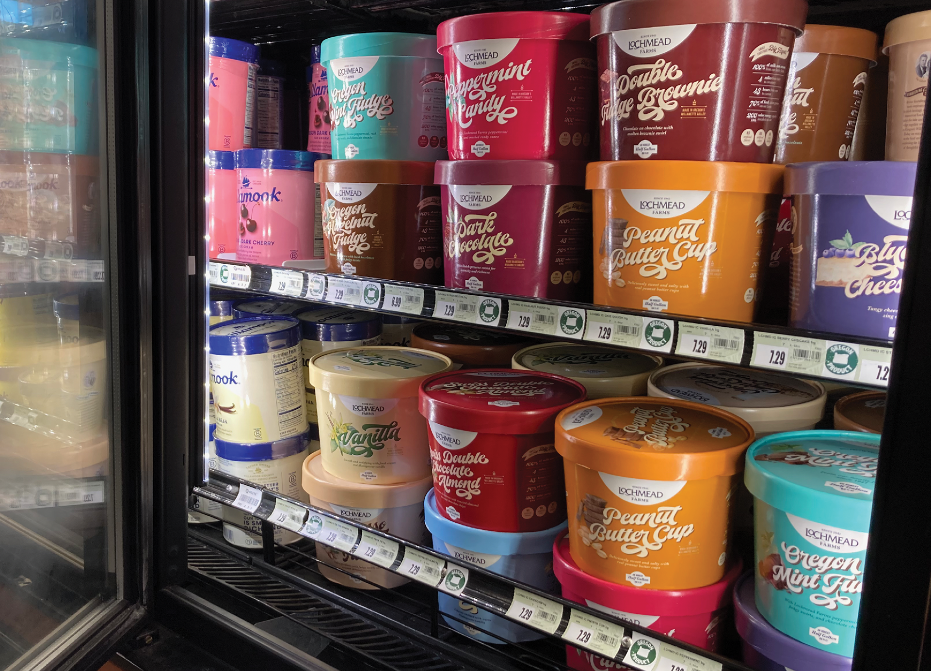
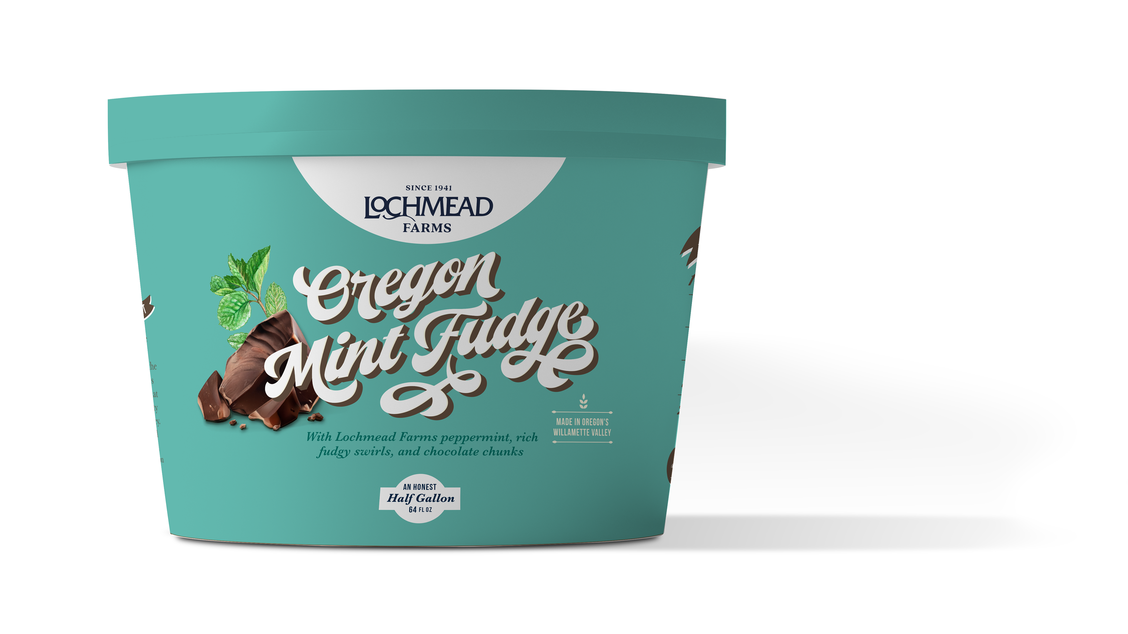
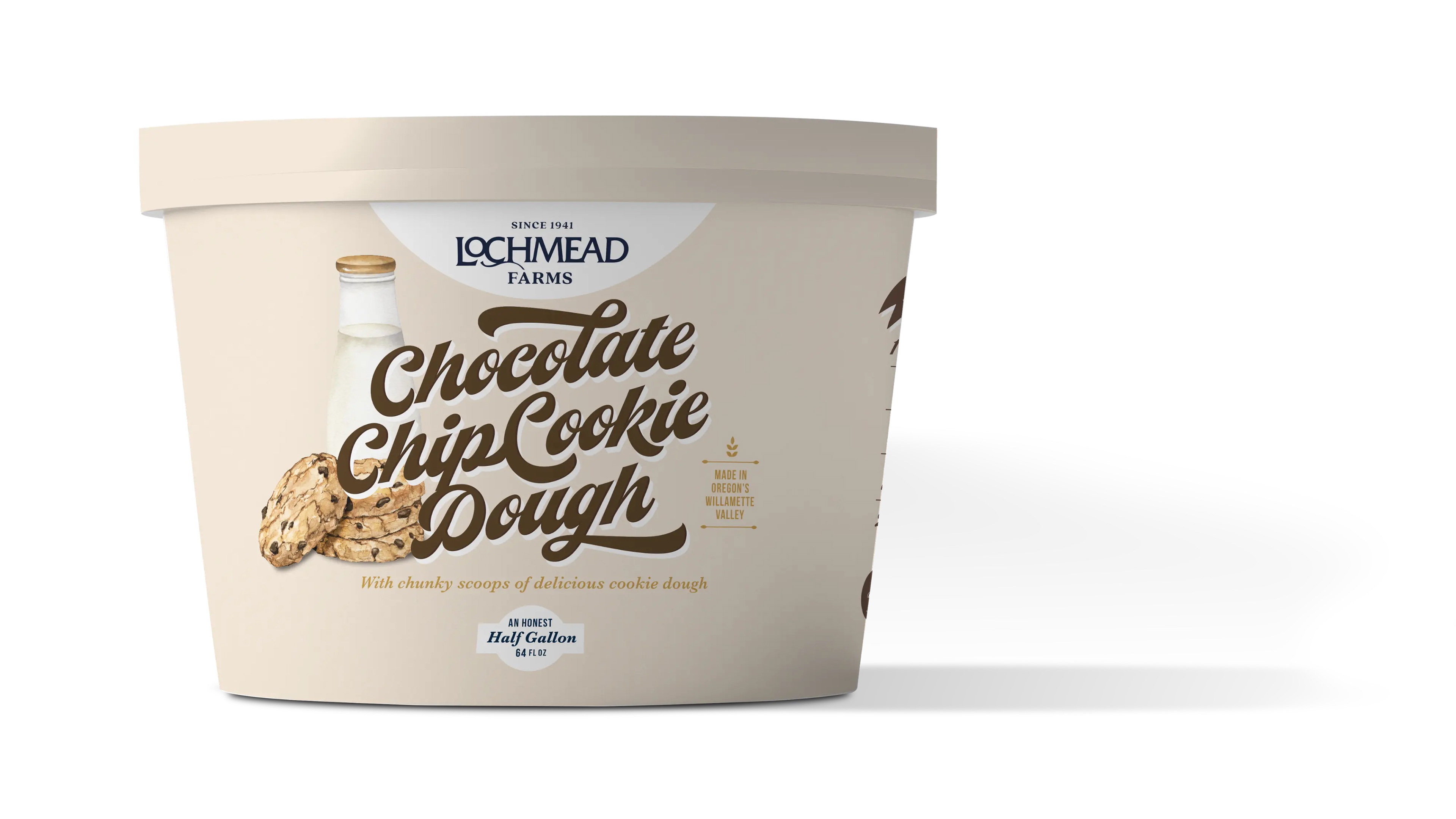
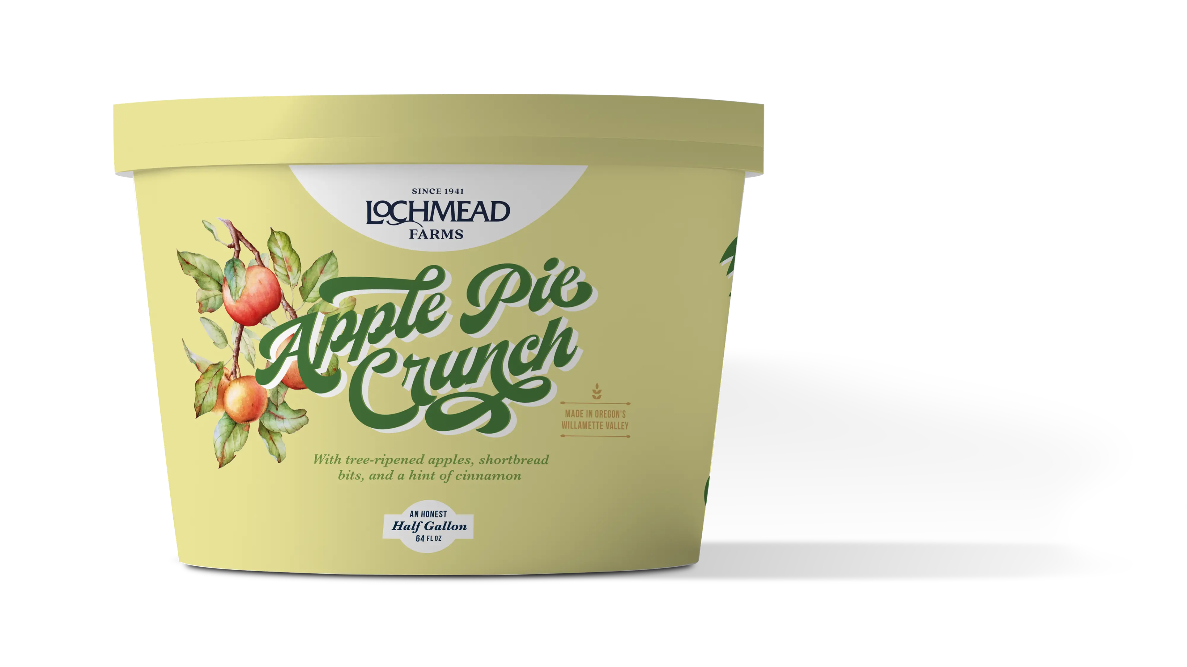
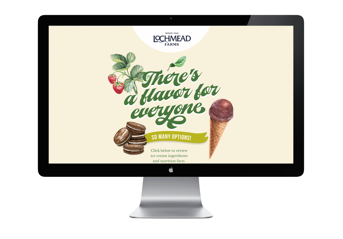
One of Oregon’s most iconic, family-owned creameries has been making single-herd ice cream for the last forty years in the heart of the Willamette Valley. To those who know Lochmead Farms, it’s an institution—loved for the quality of its product and transparency to the source.
CReative Direction | Art direction | Design | Production
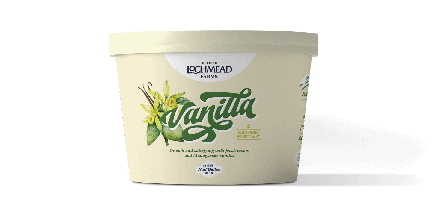
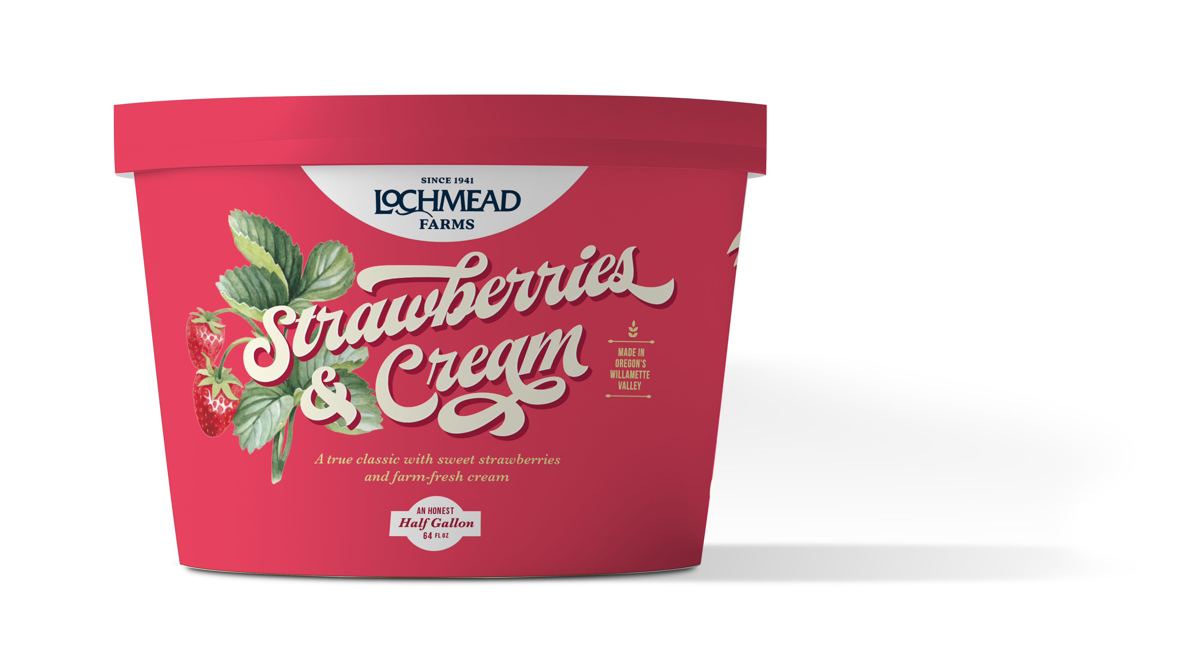
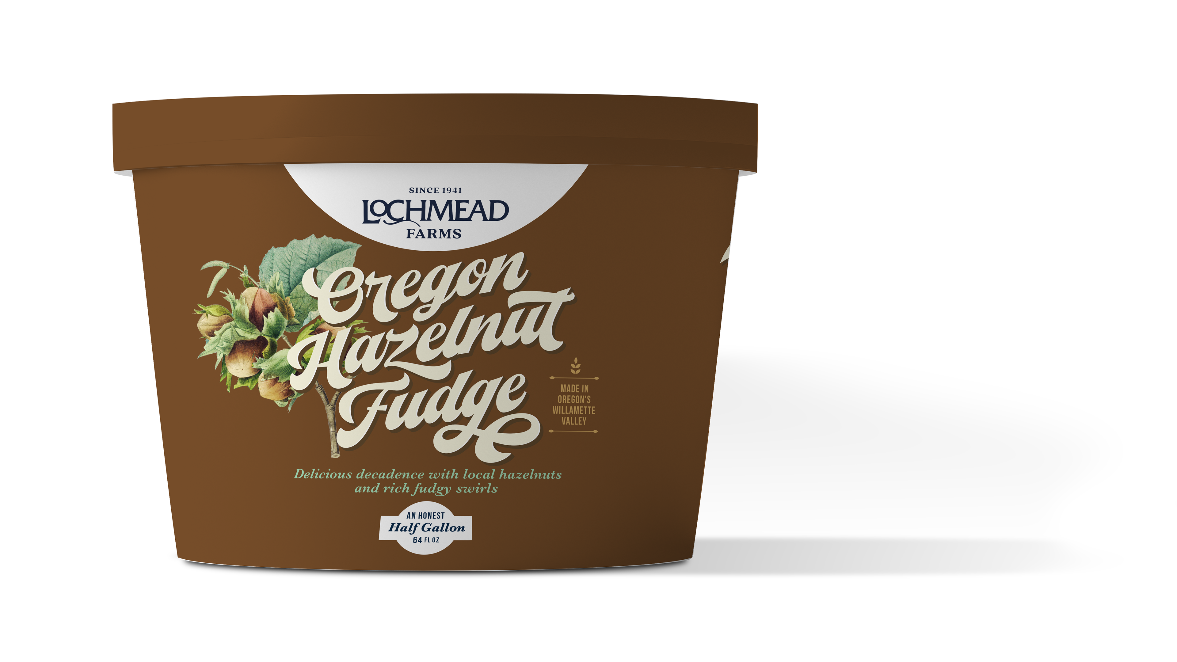
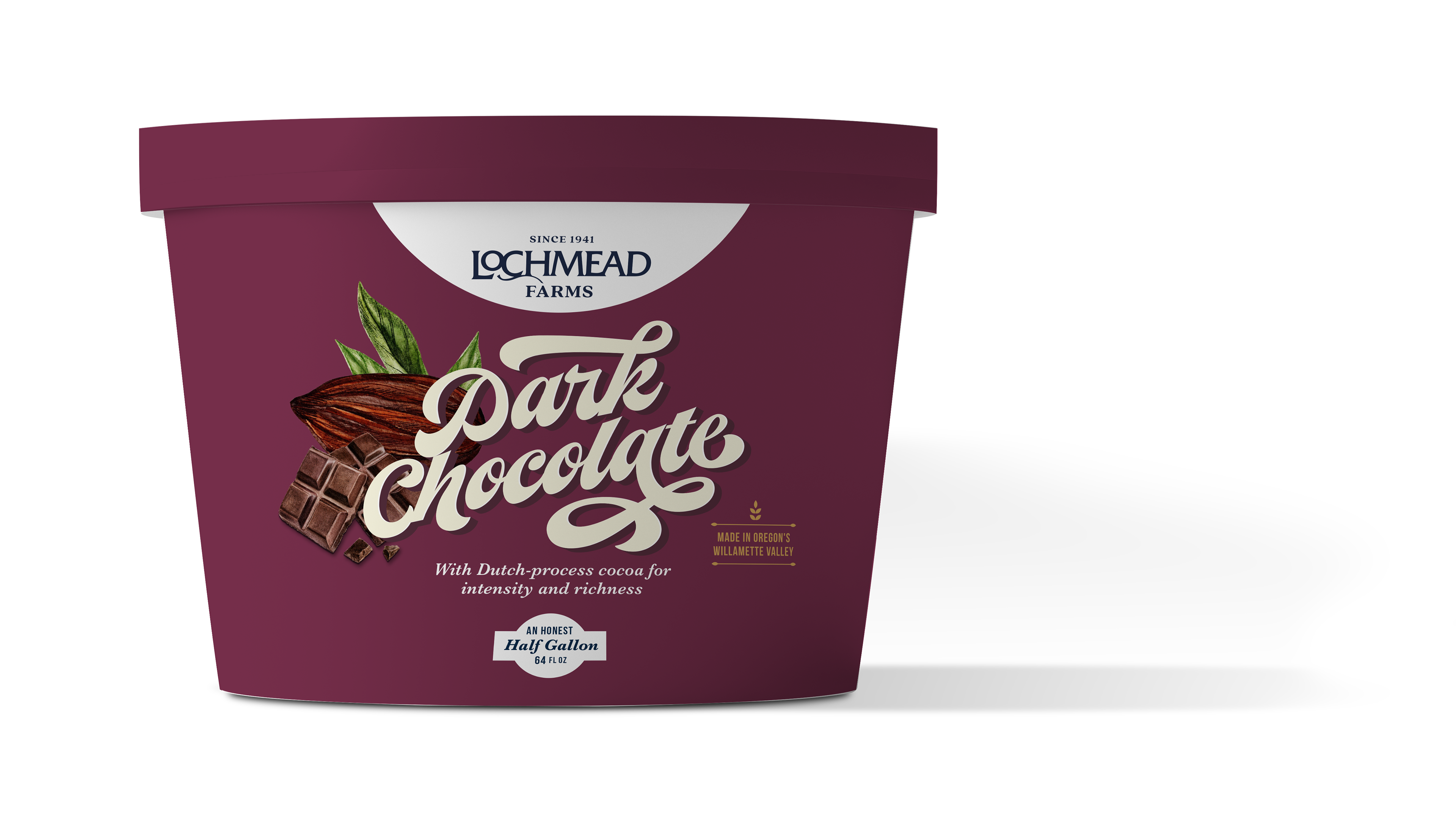
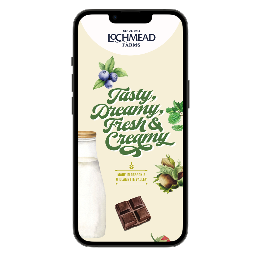
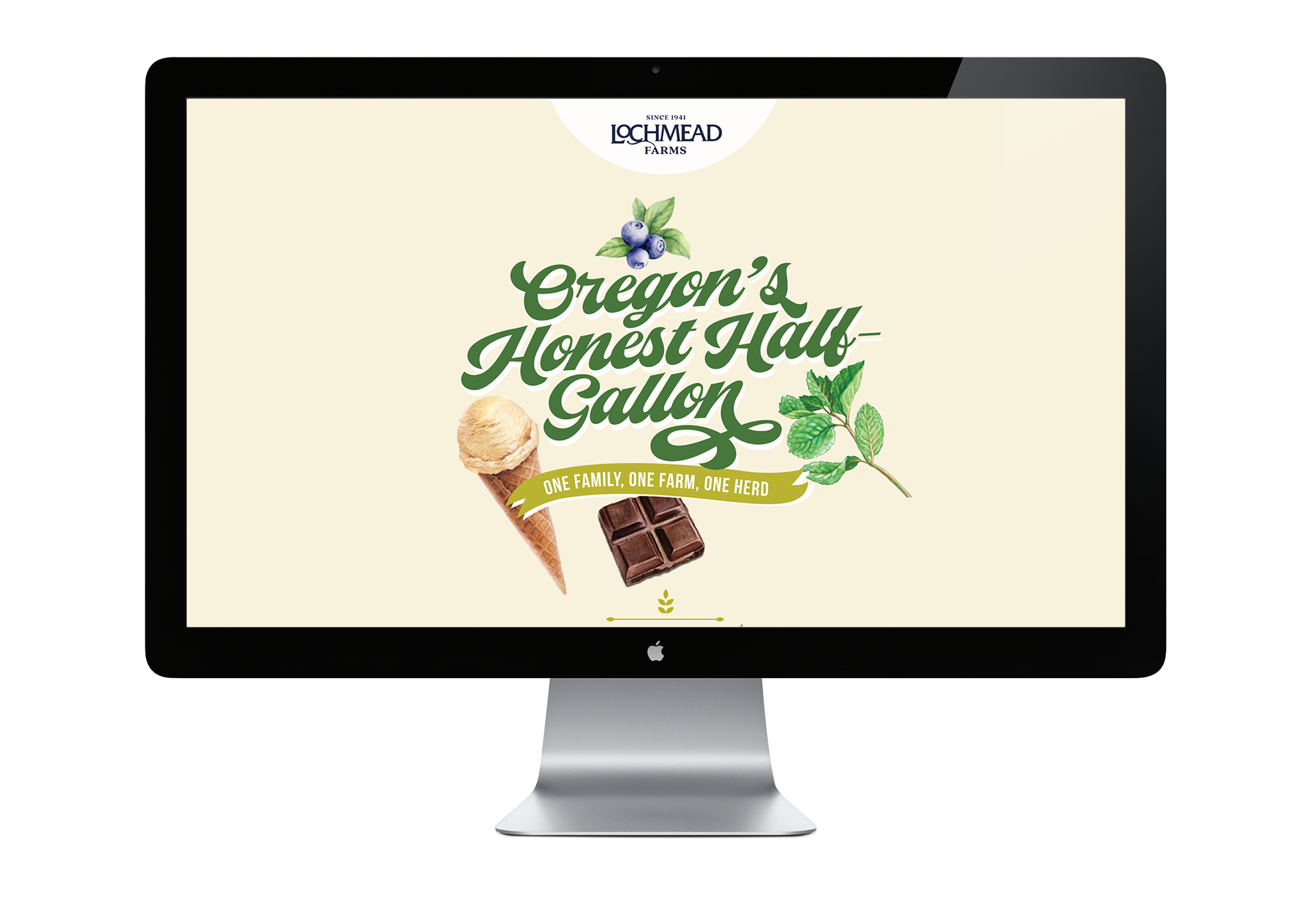
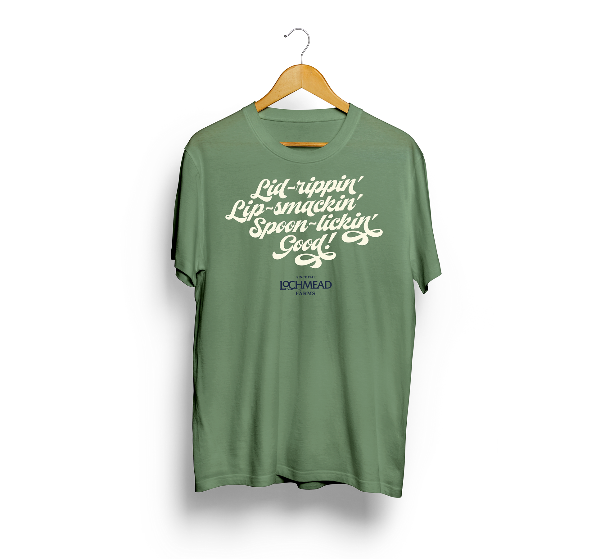
Boldly classic, the new identity draws on vintage styling cues, dynamic typography, and updated storytelling about the family farm to invoke the deep Oregon history and enduring quality of Lochmead ice cream.
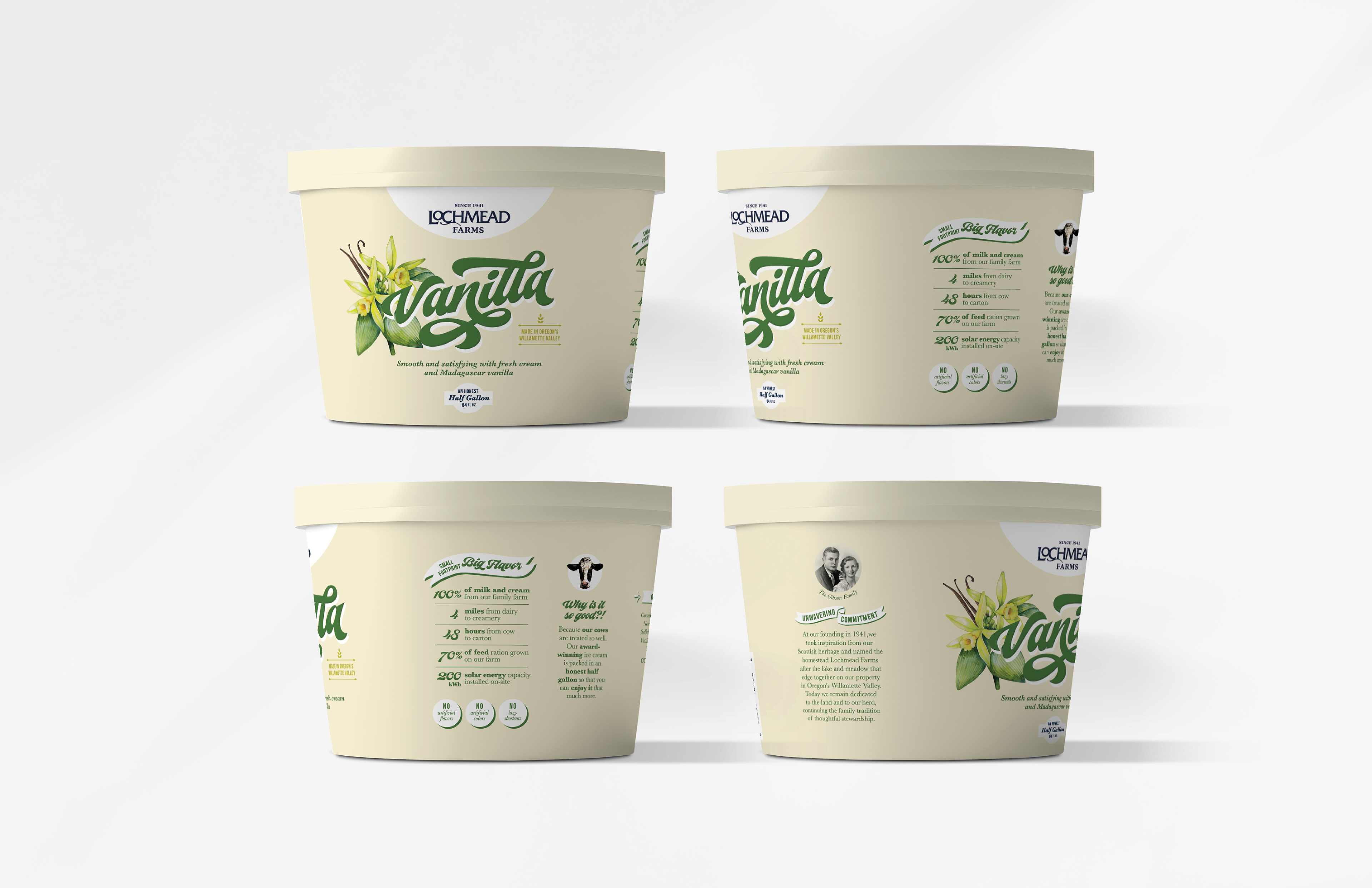
Lochmead saw an opportunity to become more competitive in the ice cream aisle by better representing the quality of its product through an improved look, feel, and voice. After broad exploration, we arrived at a look and feel that emboldened the Lochmead Farms ice cream carton while staying true to—and even clarifying—the brand’s DNA.