
A New Chapter for a Beloved Oregon Institution
For nearly four decades, Literary Arts has fostered community through books, storytelling, and the essential conversations they inspire. By 2016, their identity no longer reflected that clarity of mission. Visually inconsistent and difficult to use, the existing system felt more like noise than voice.
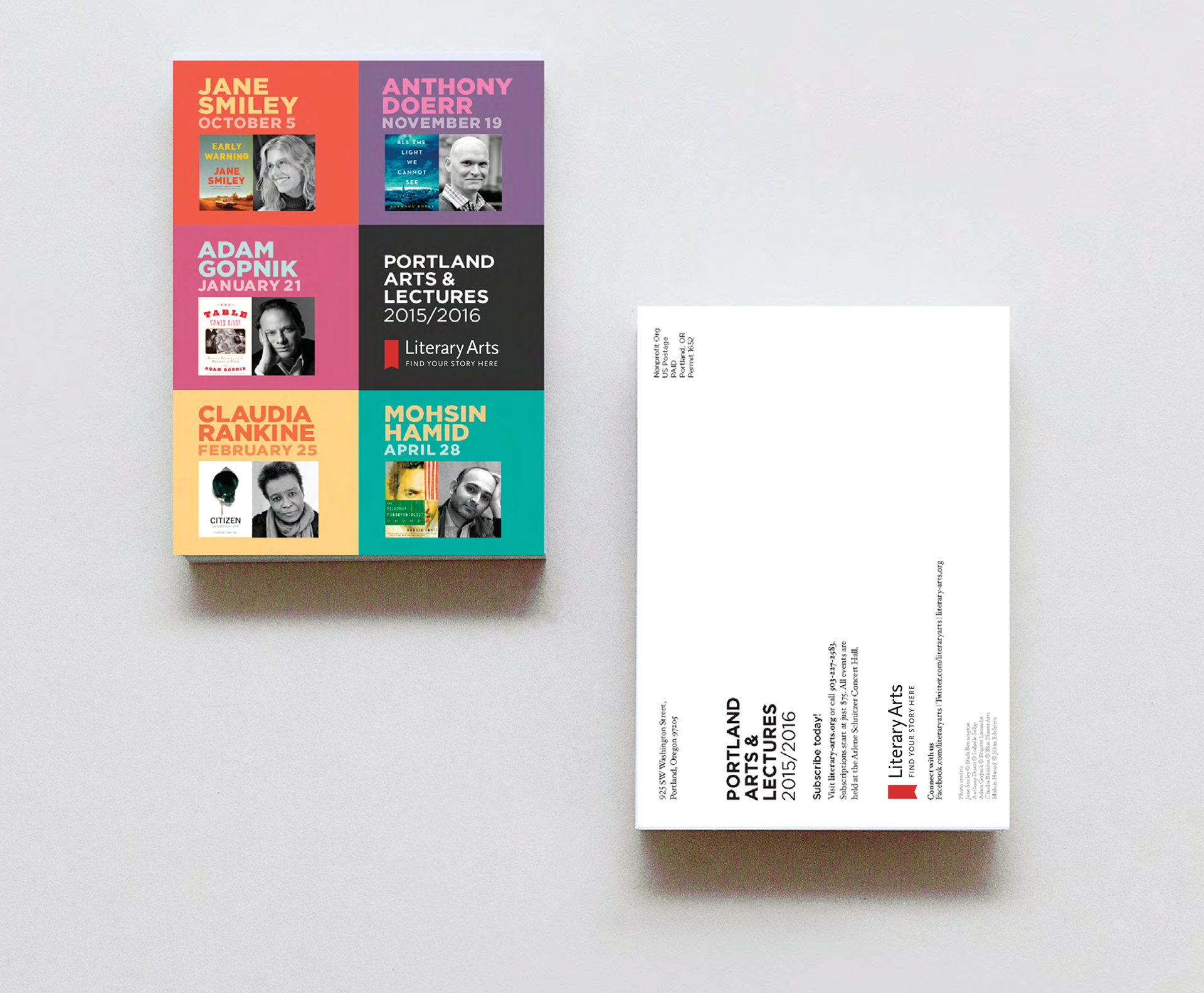
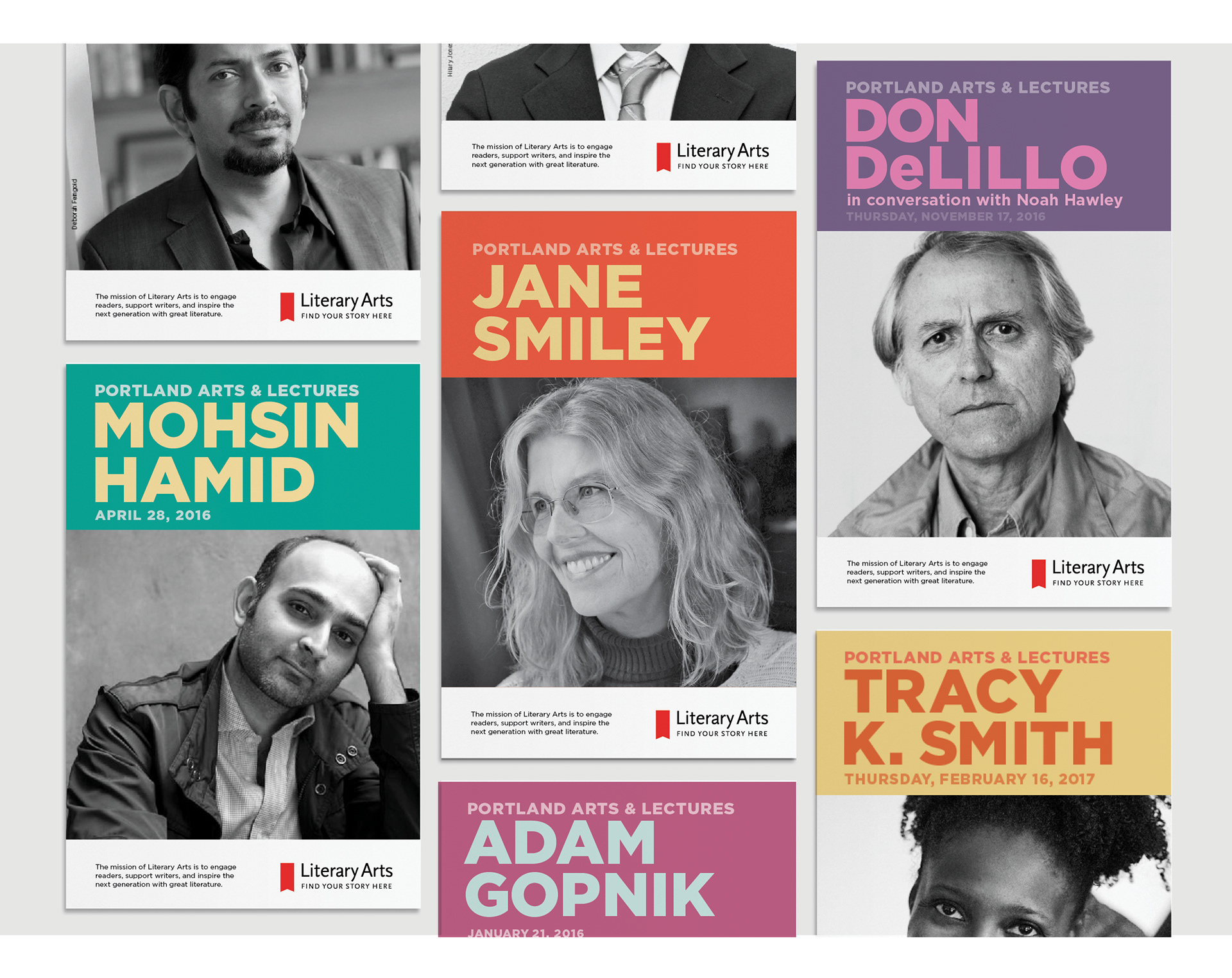
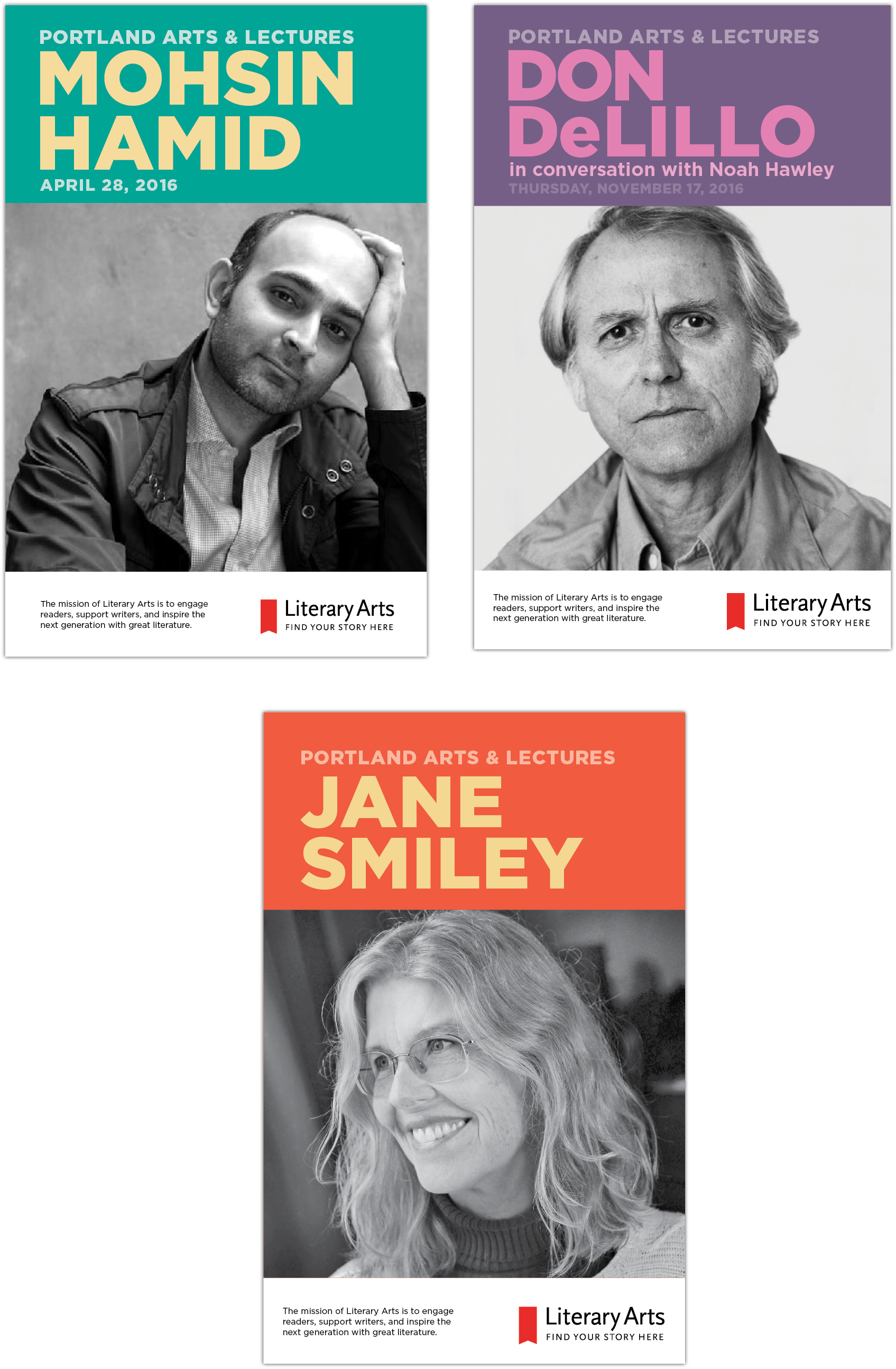
We saw an opportunity to bring alignment and focus. Our solution: a clean, flexible logo mark, paired with a bold typographic system and a vibrant, dynamic color palette. Together, these elements shift the spotlight back where it belongs—on the authors, ideas, and programs that have made Literary Arts a cultural cornerstone for nearly 40 years.
Creative direction | Art direction | Graphic design
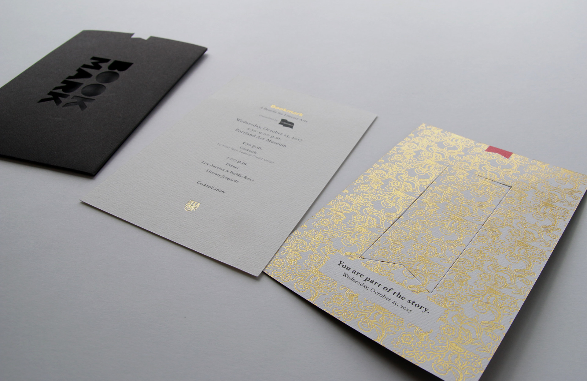
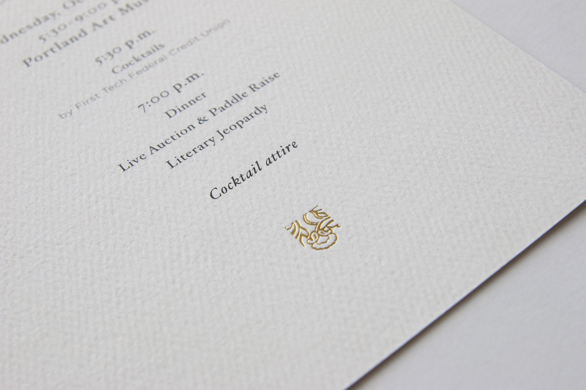
Brand identity, Print Collateral, Book design, Event materials
Brand identity, Print Collateral, Book design, Event materials