
Letting the Vineyards Speak
In 2023, Purple Hands—named one of Wine Spectator’s Top 100 Wines in the World—approached us to help “grow up” their brand. They wanted an identity as refined as their wines, and as rooted as their vines.
Brand strategy | Identity design | Packaging | Style guide | Collateral | Environmental
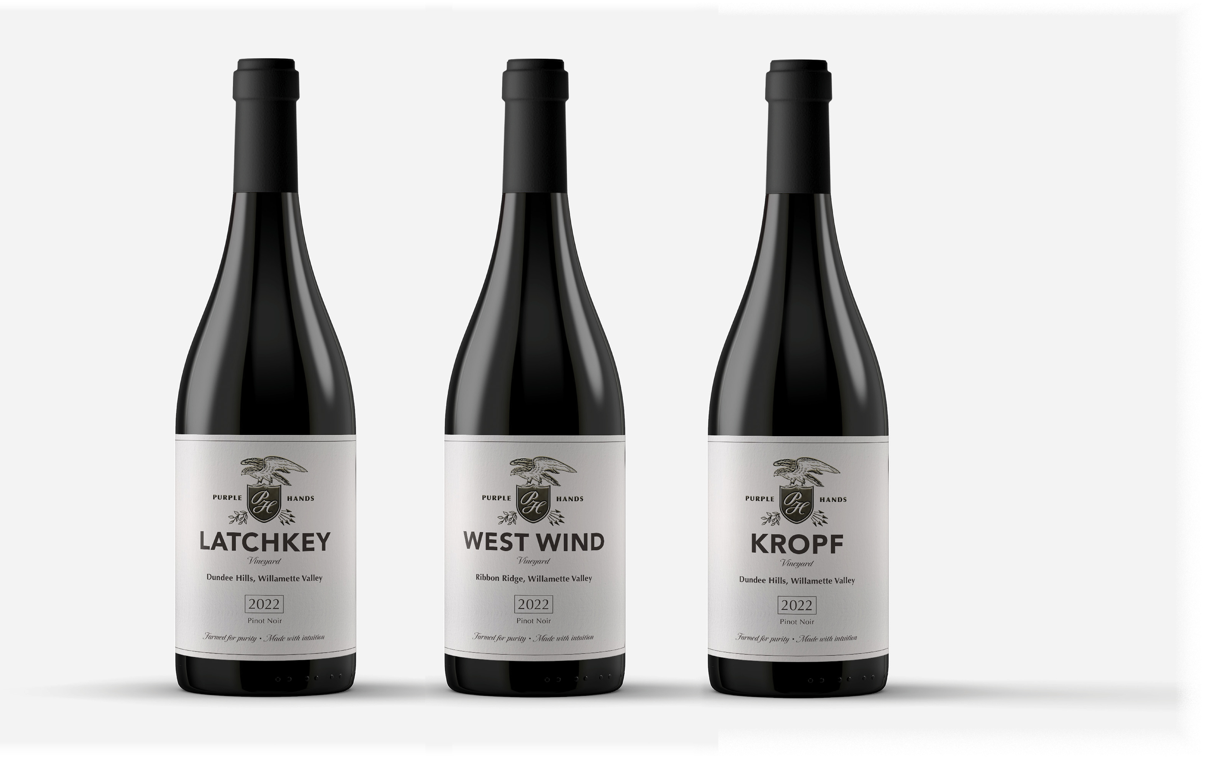
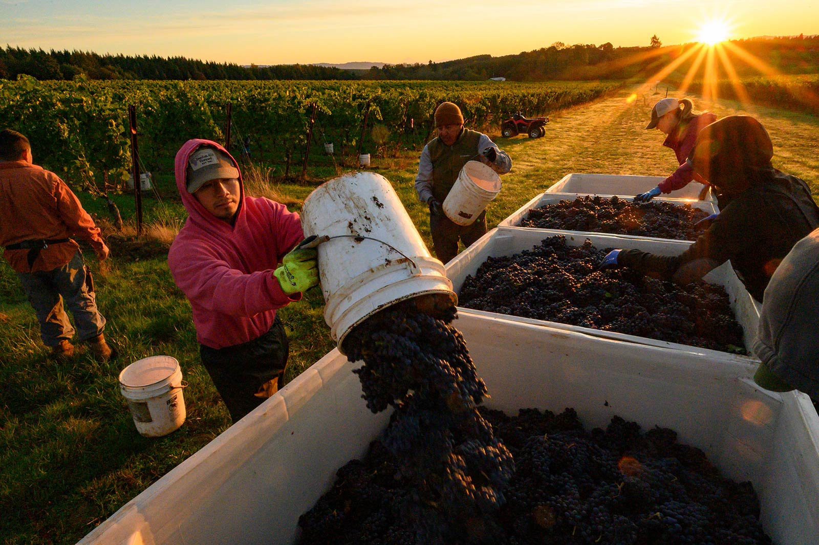
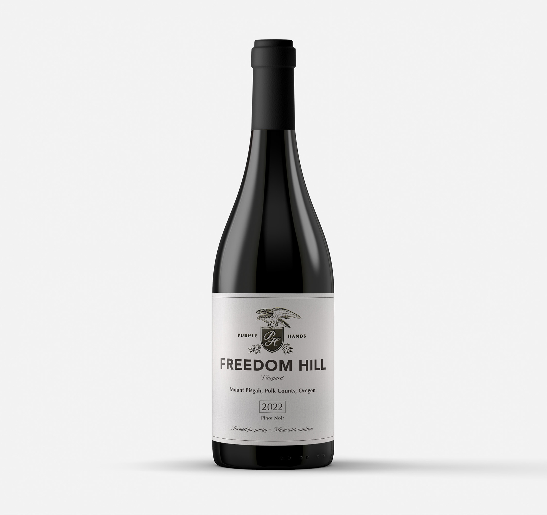

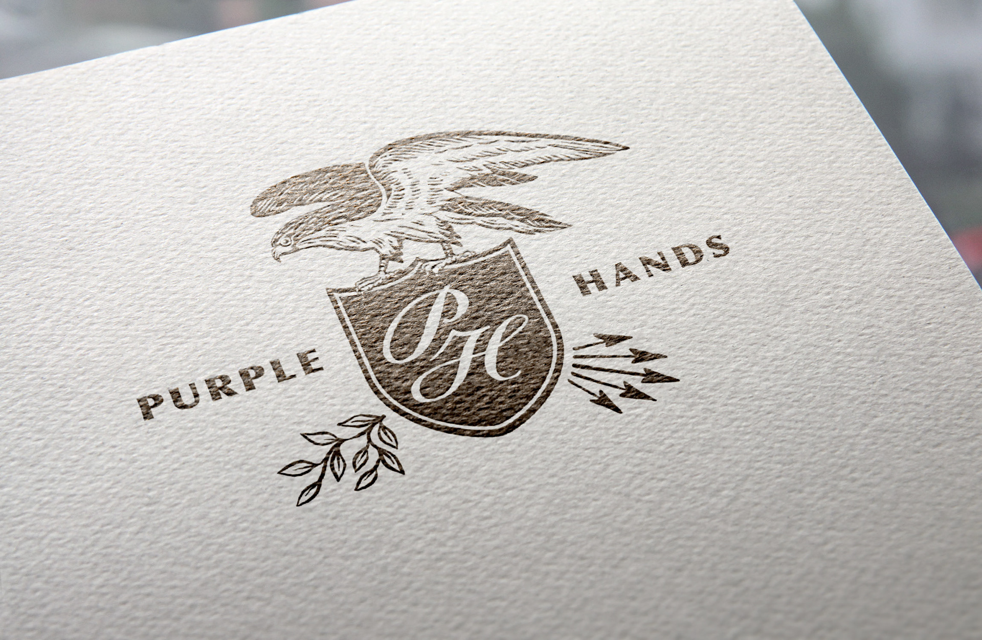
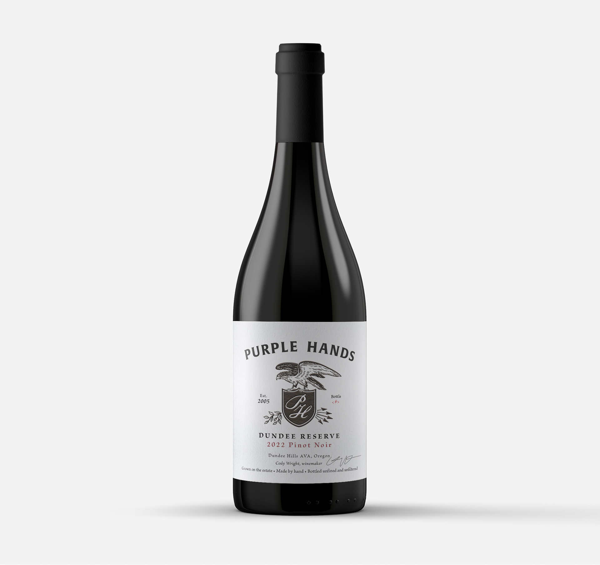
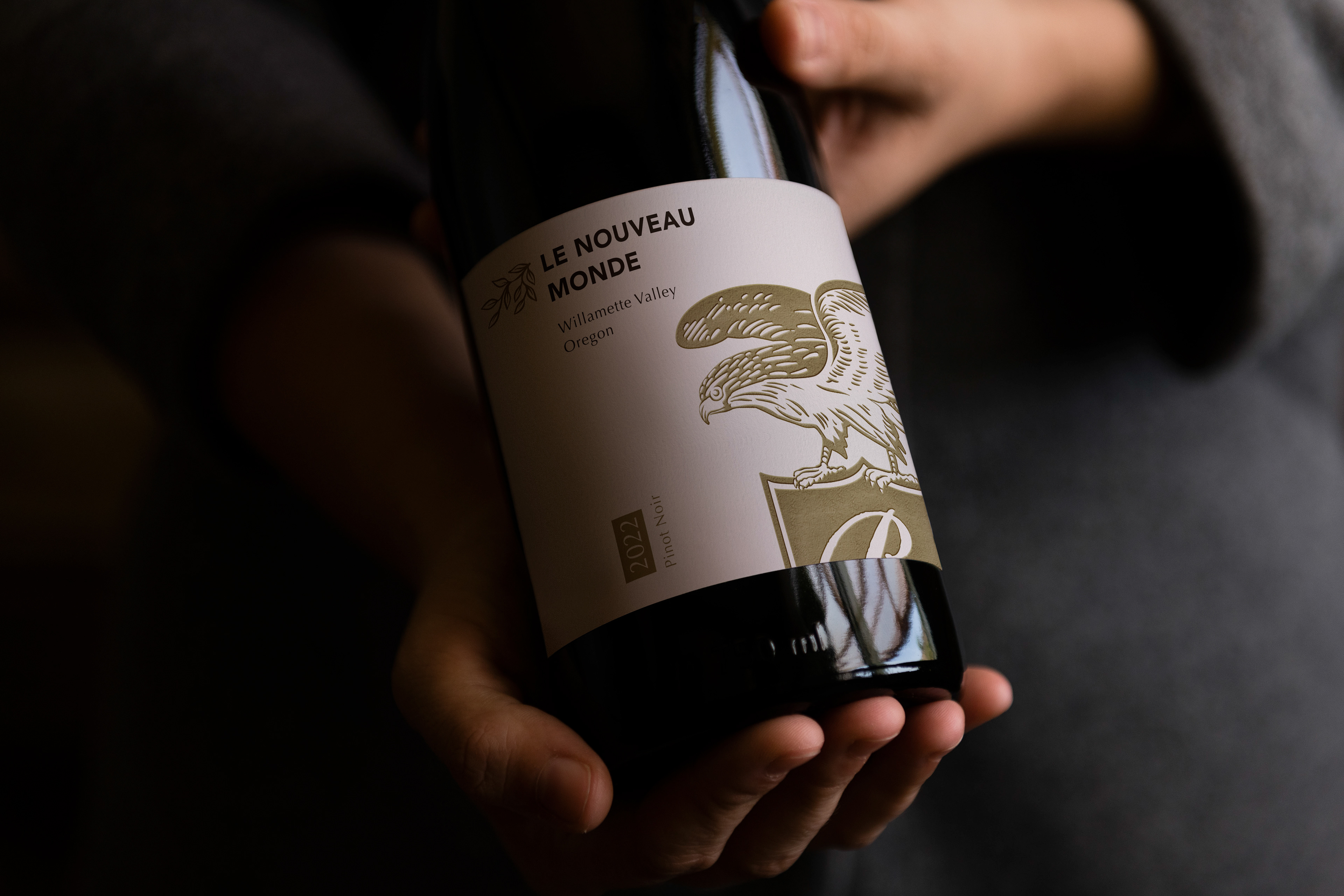
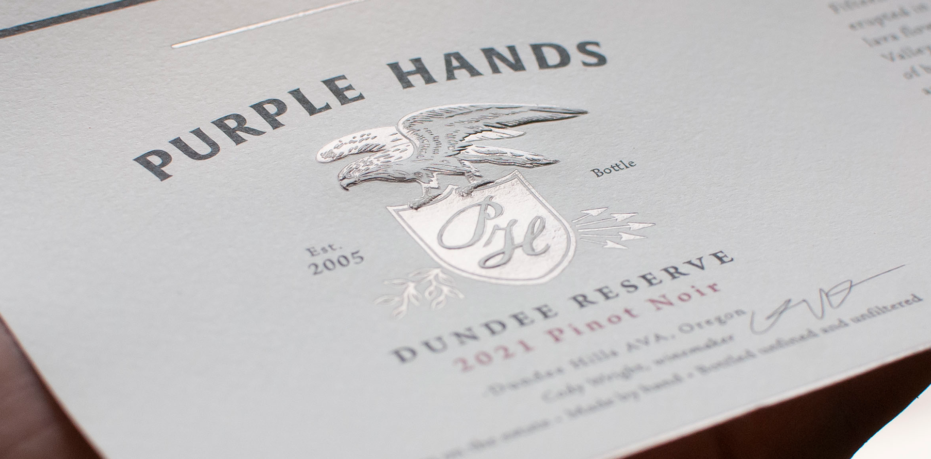
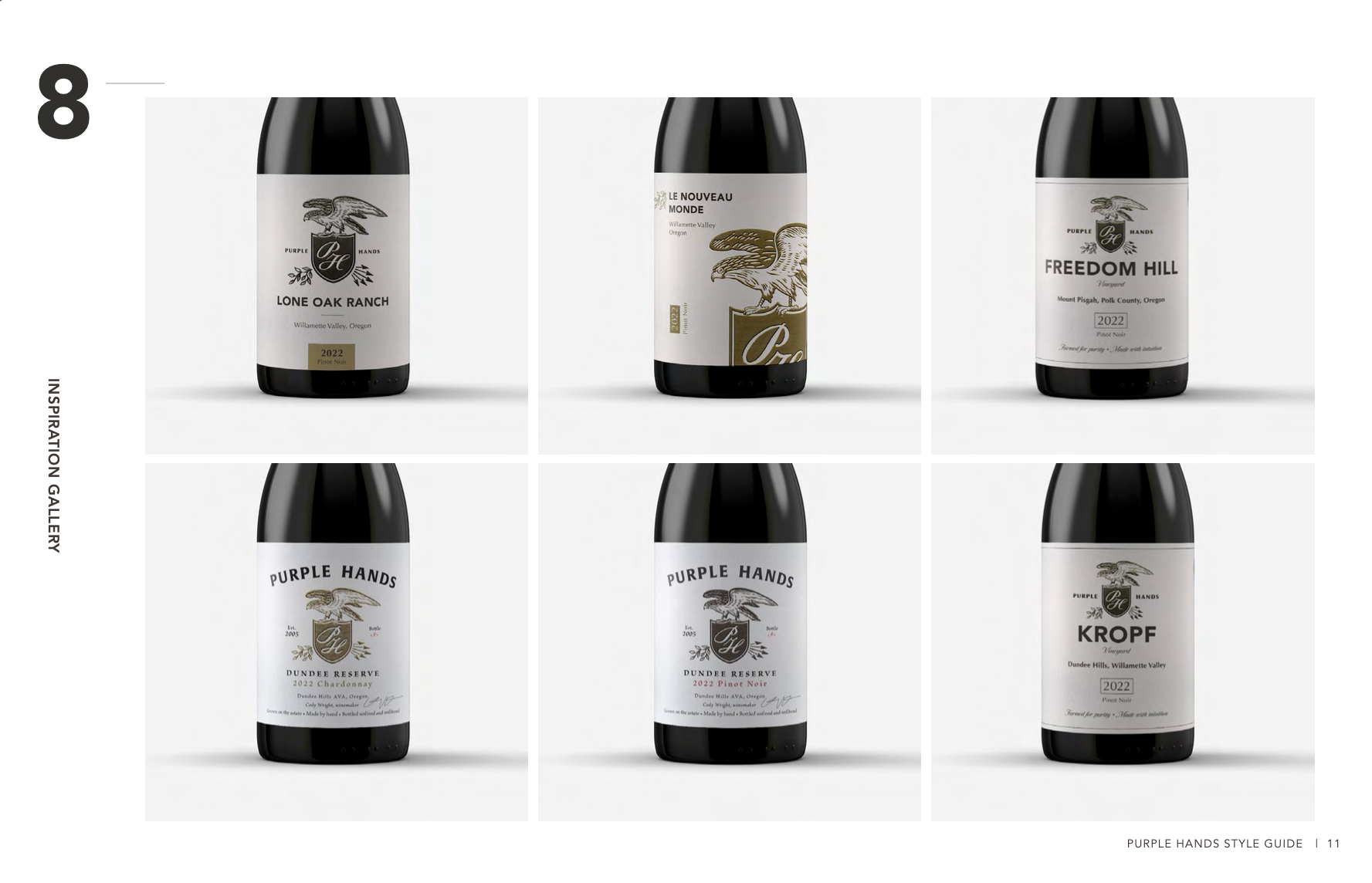
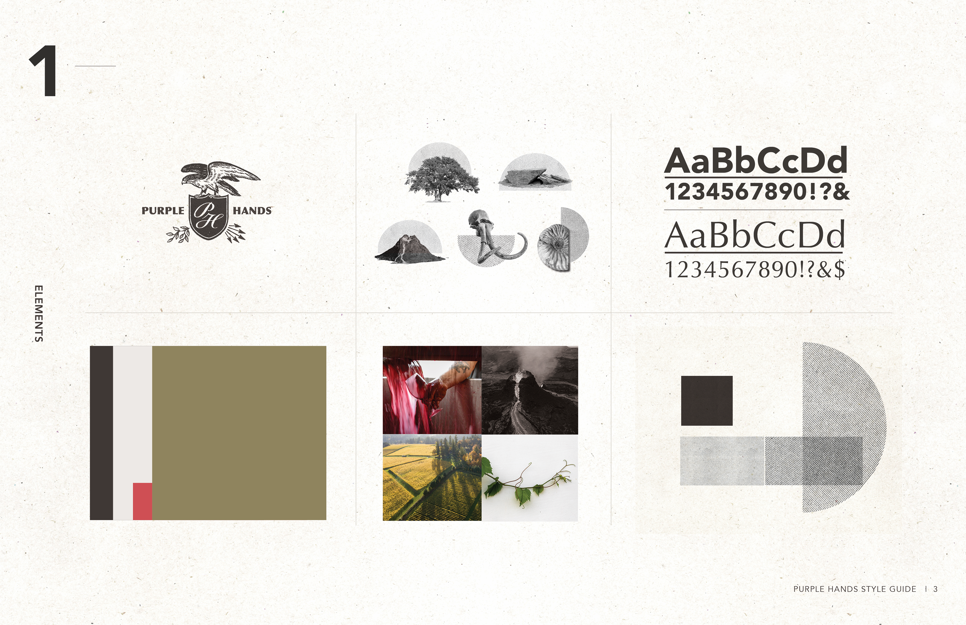
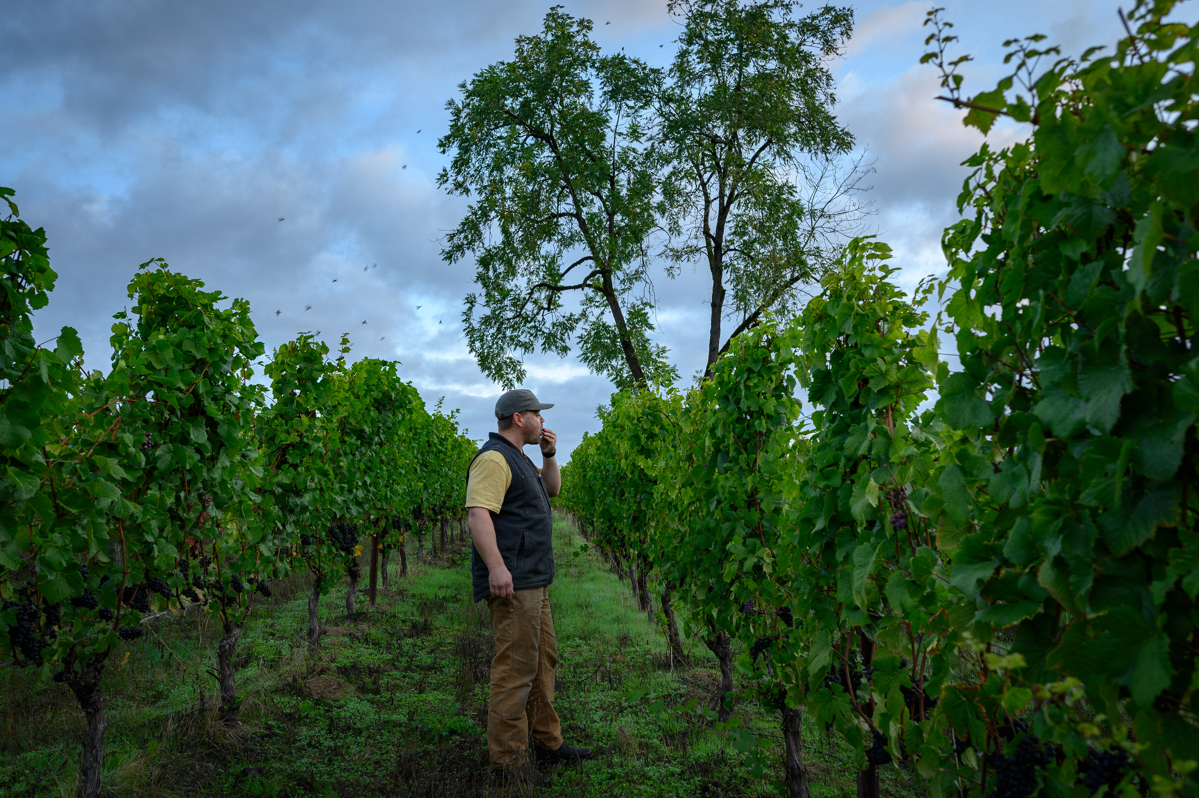
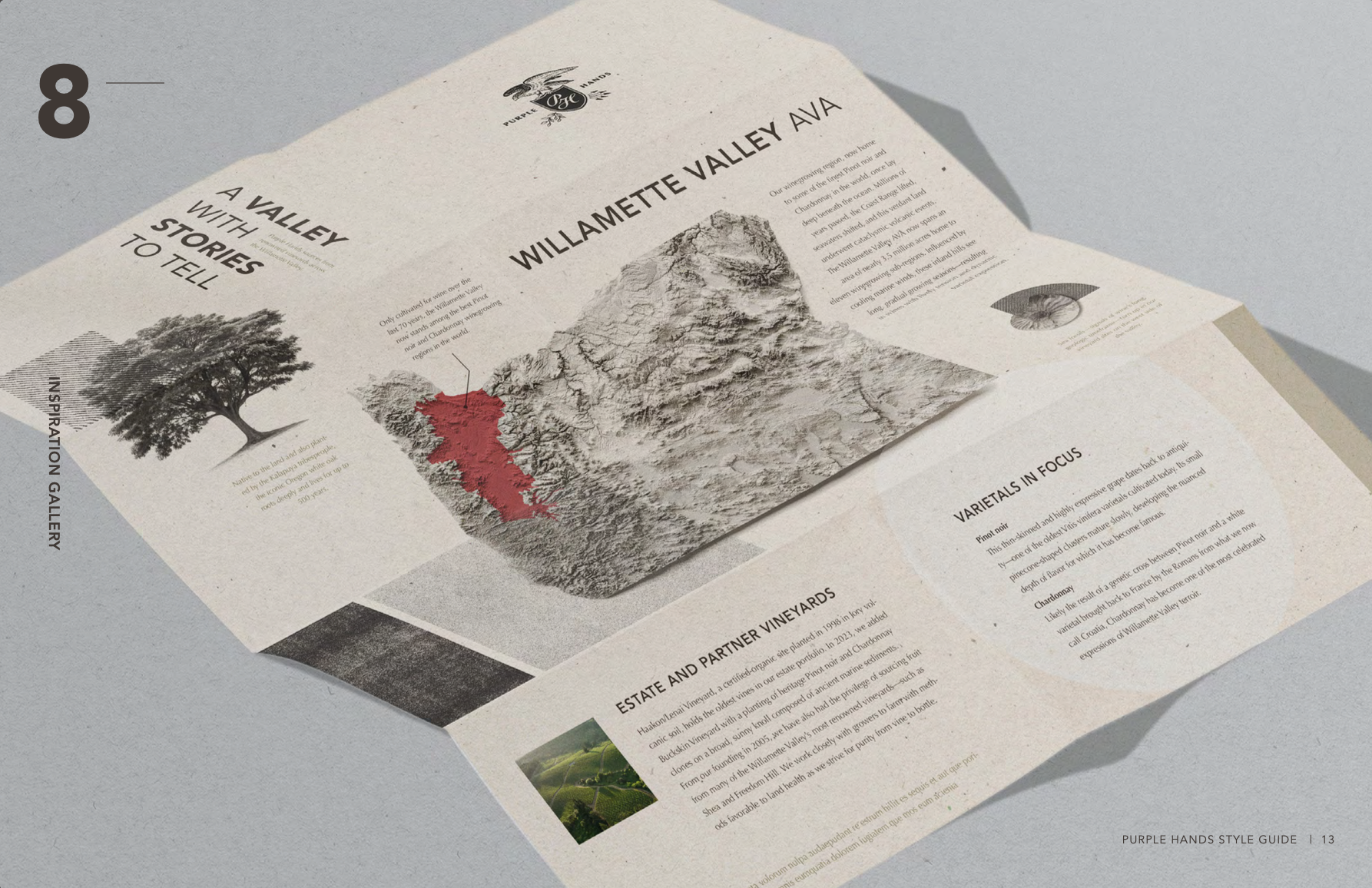
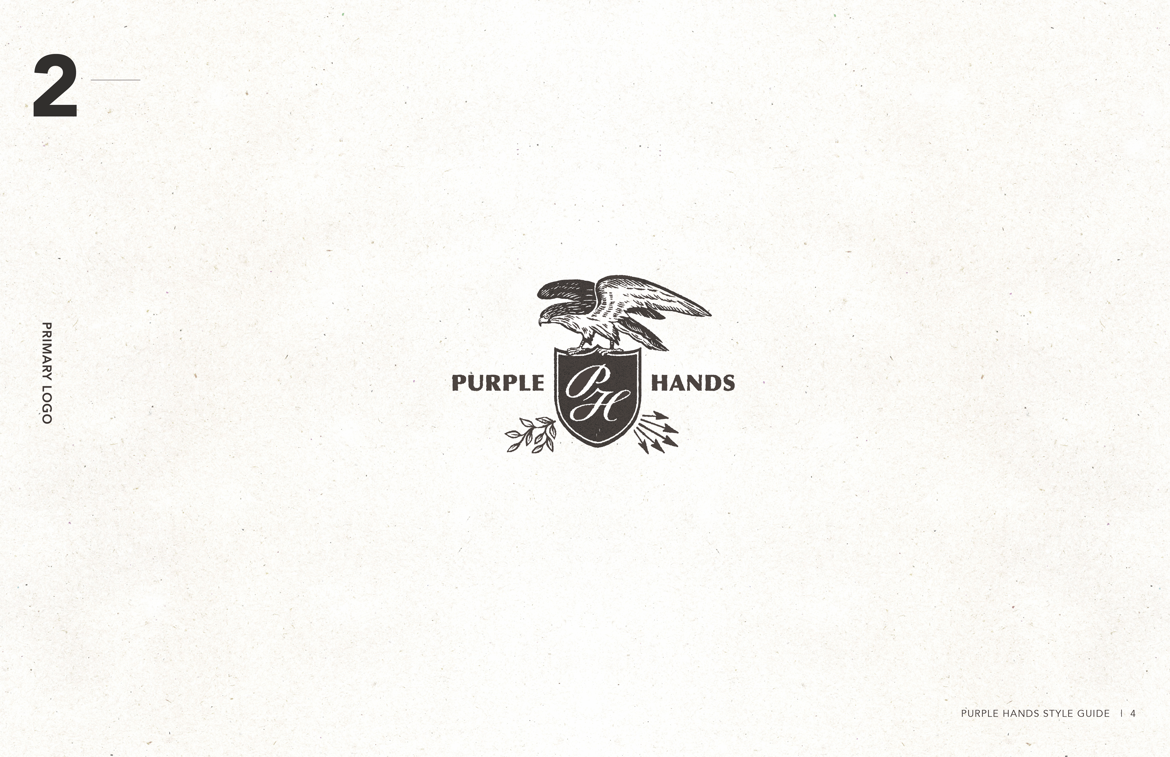
We began with the logo. By replacing the outdated bald eagle with a red-tailed hawk—native, watchful, and wild—we grounded the mark in meaning and simplified it for real-world use. The result: a strong, flexible identity that exudes the Willamette Valley vineyards that make it all happen.

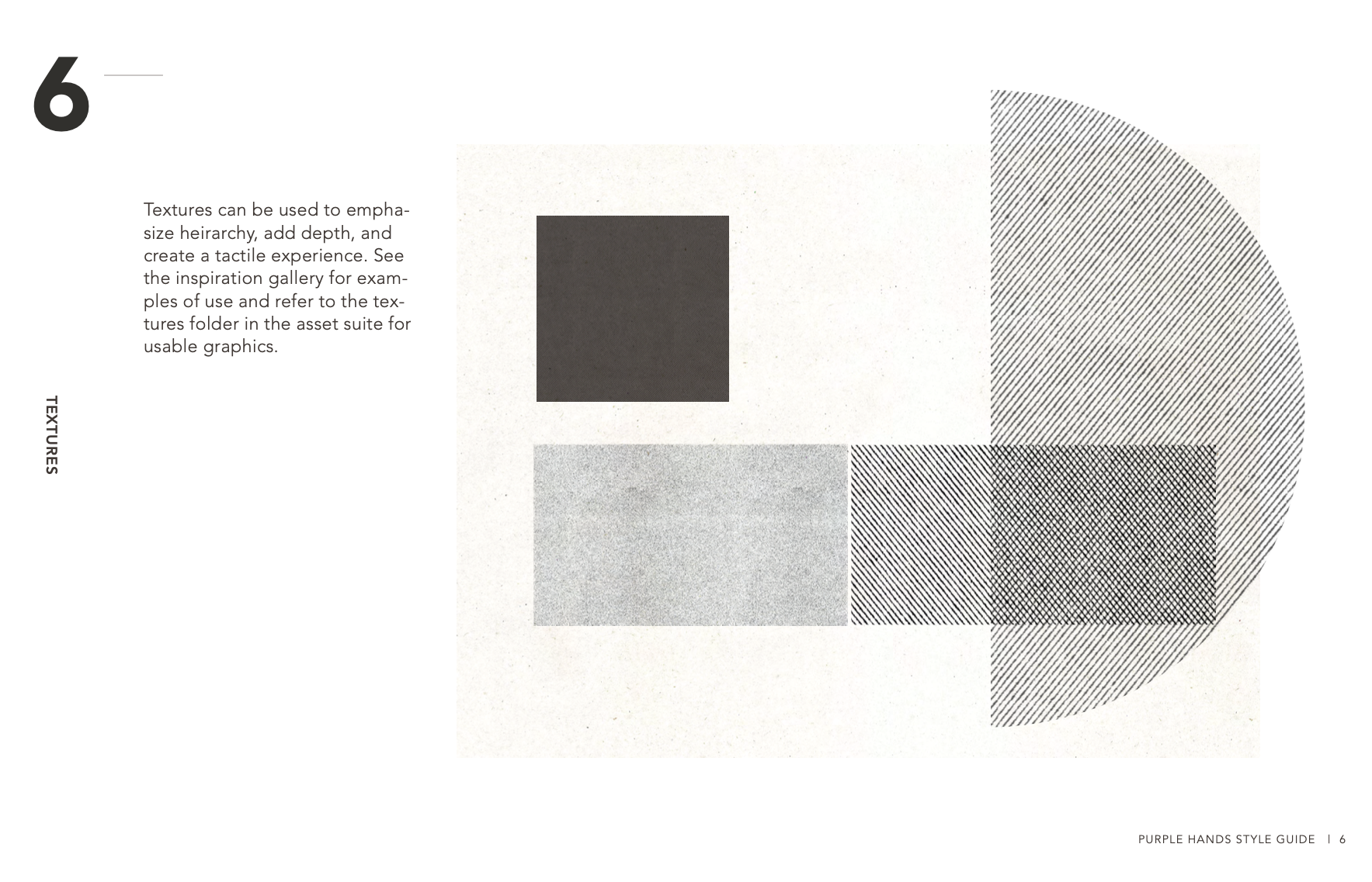
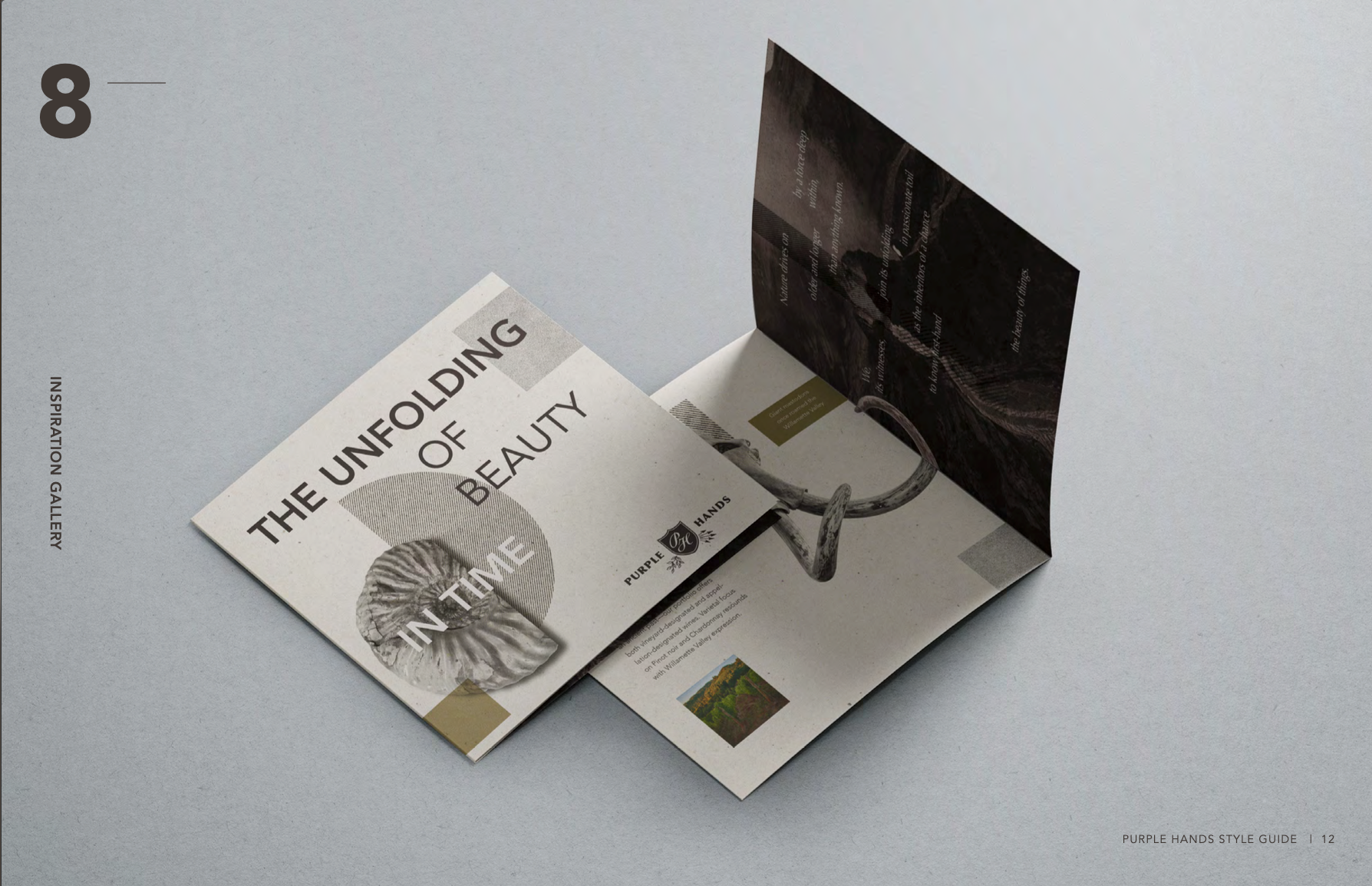
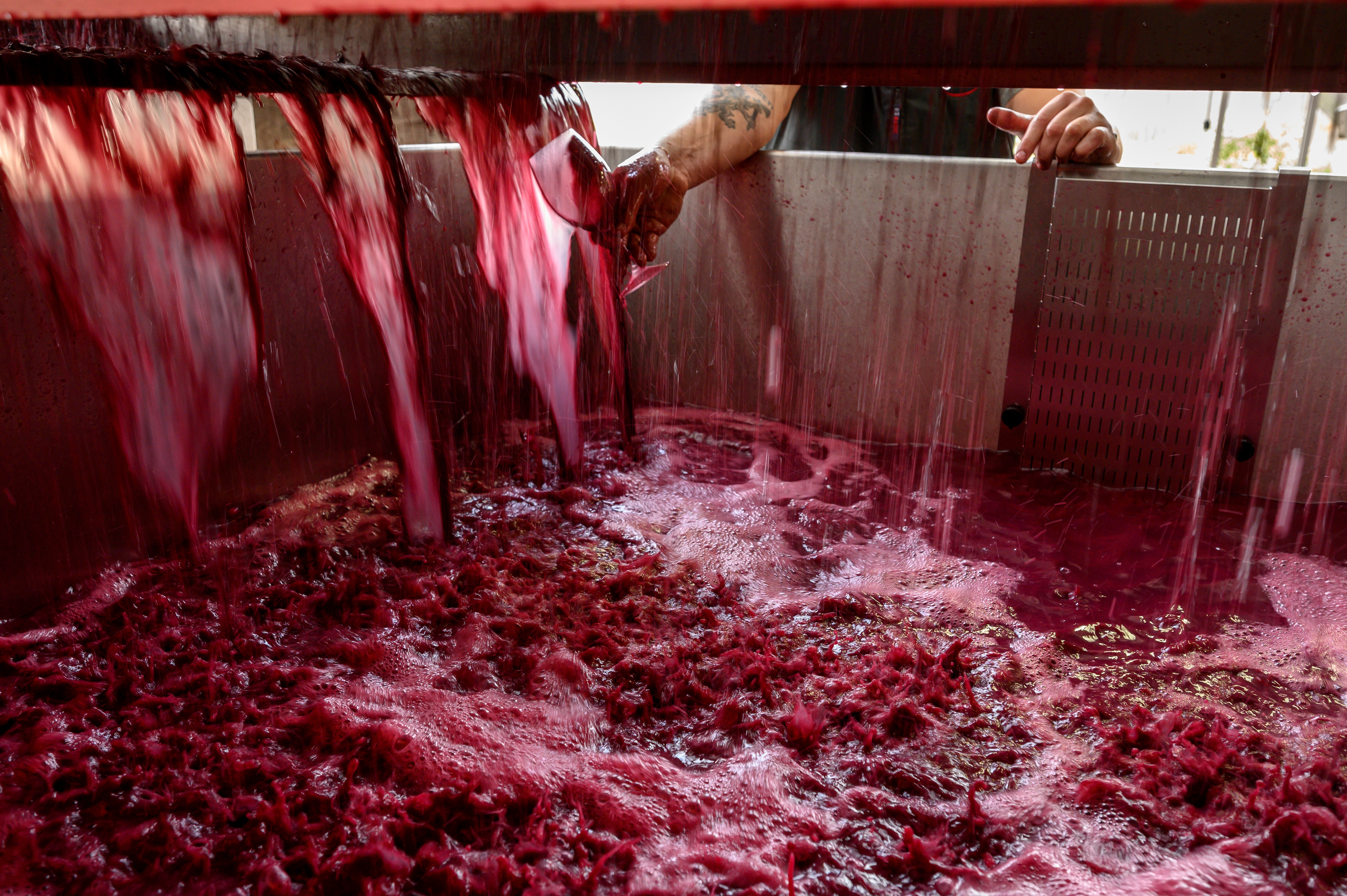
The new label system follows suit. Bold, typographic, and richly detailed, it mirrors Purple Hands’ winemaking philosophy: expressive of place, shaped by land, and deeply Oregonian at heart.


Creative Direction | Art Direction
Brand identity, Logo design, Packaging, Signage, Style guide
Brand identity, Logo design, Packaging, Signage, Style guide