


Creative Direction | Art Direction
Brand identity, Logo design, Packaging, Signage, Style guide
Brand identity, Logo design, Packaging, Signage, Style guide
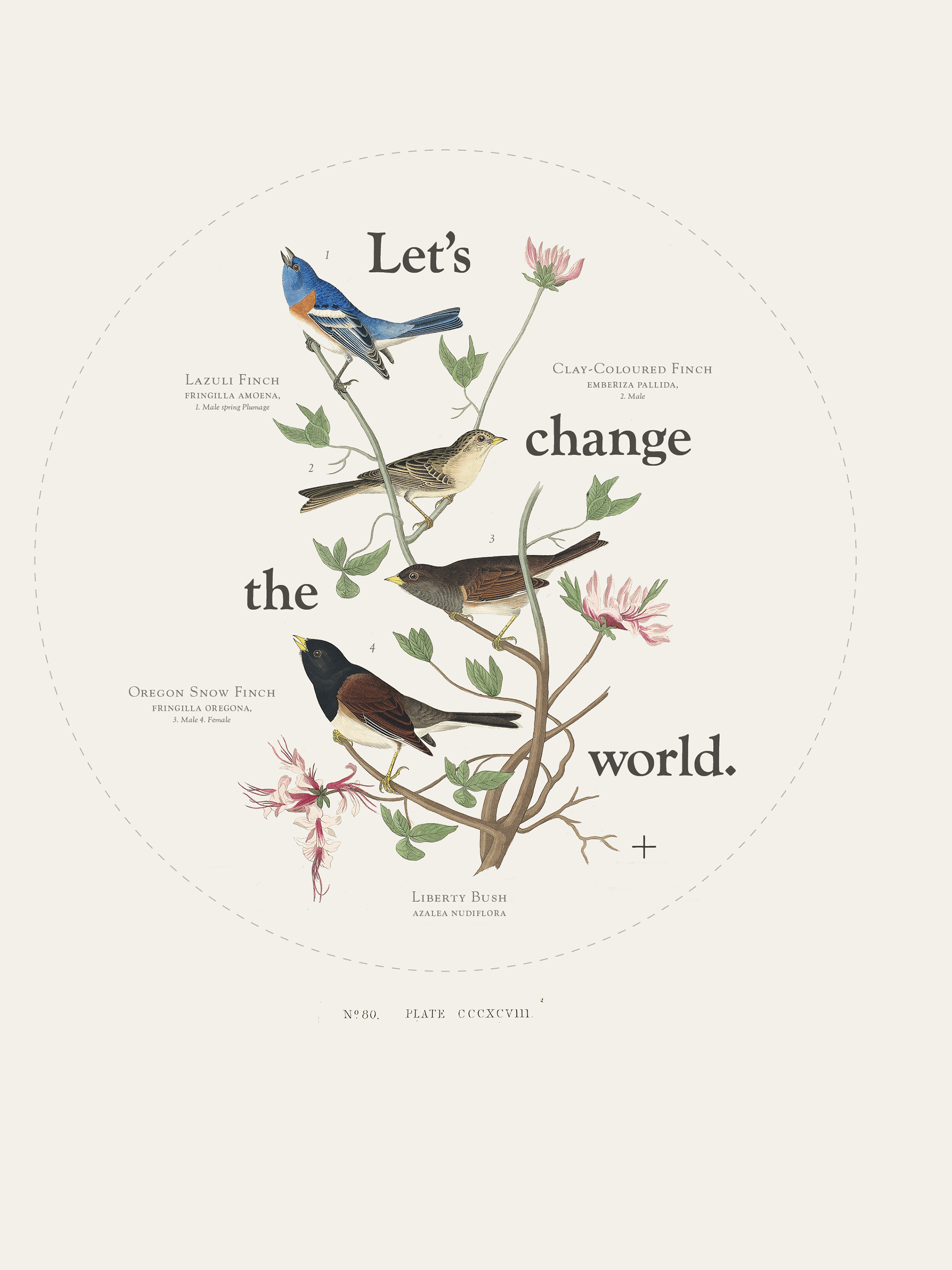
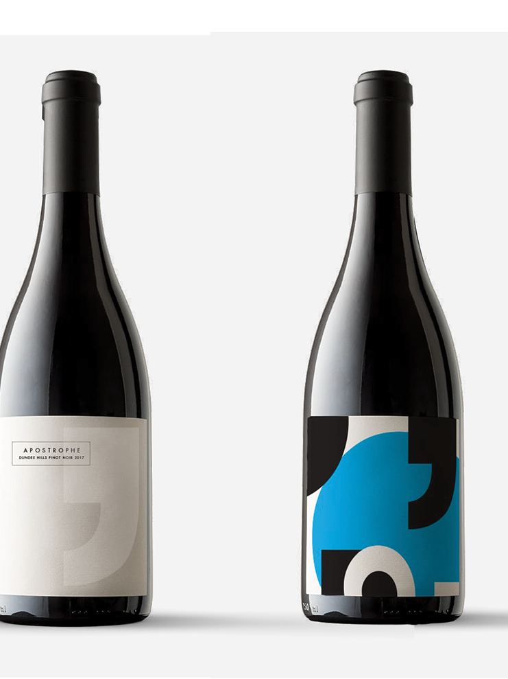
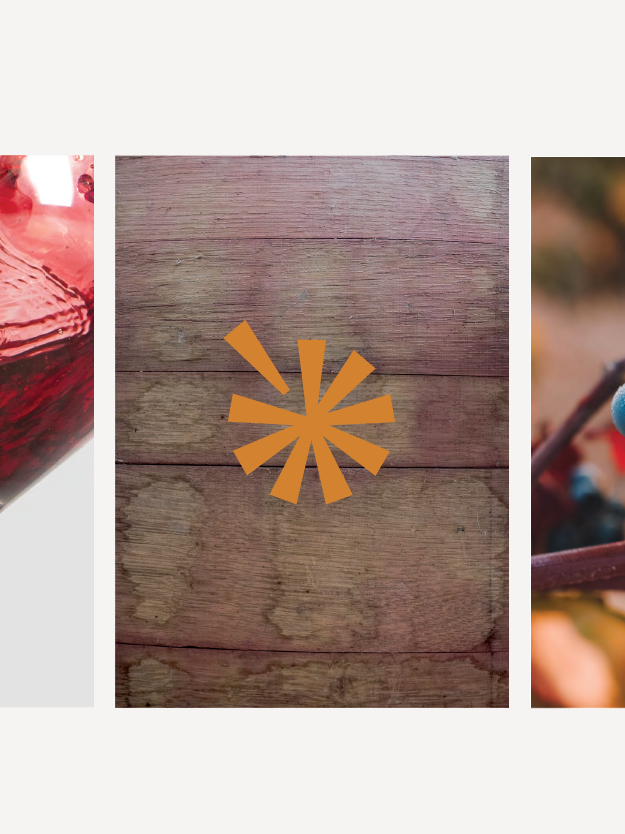
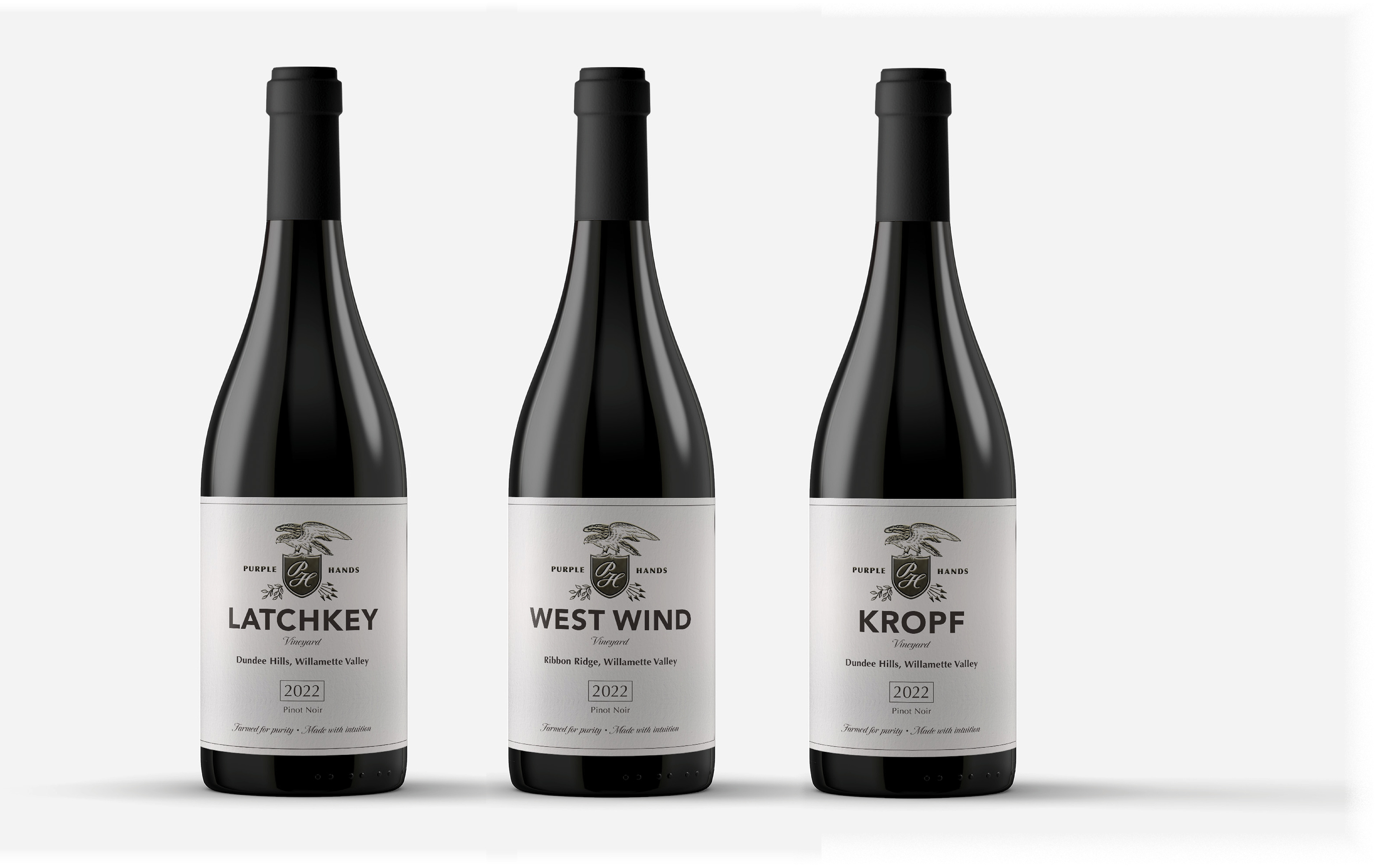
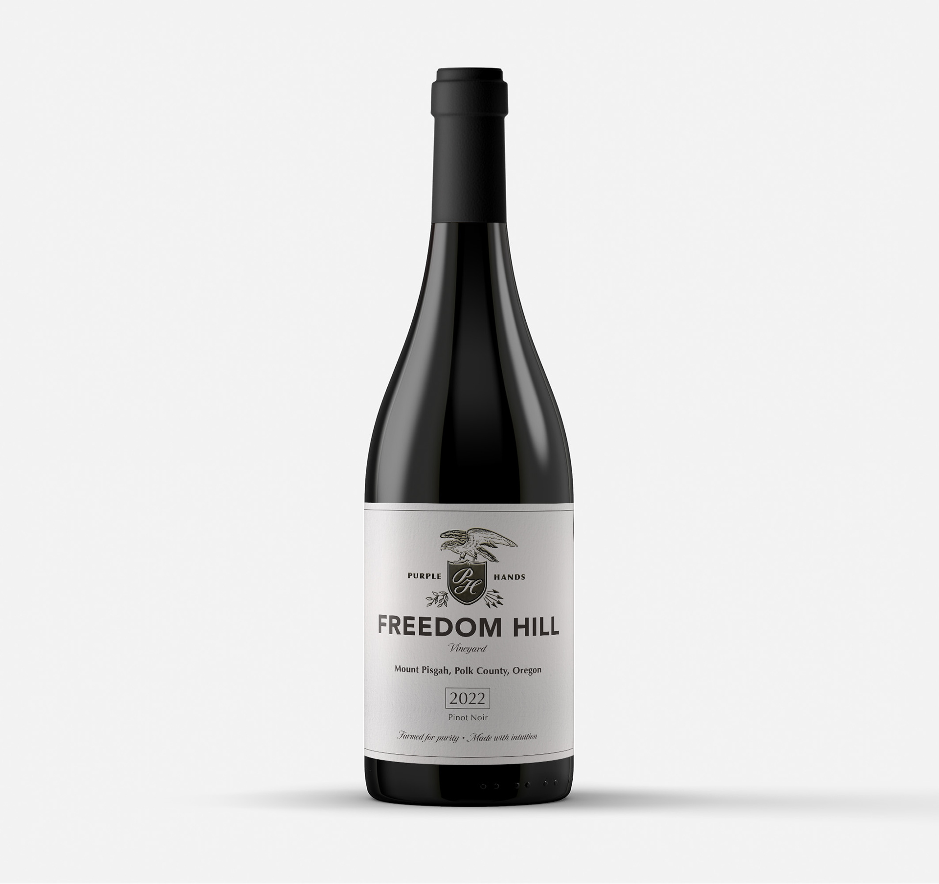
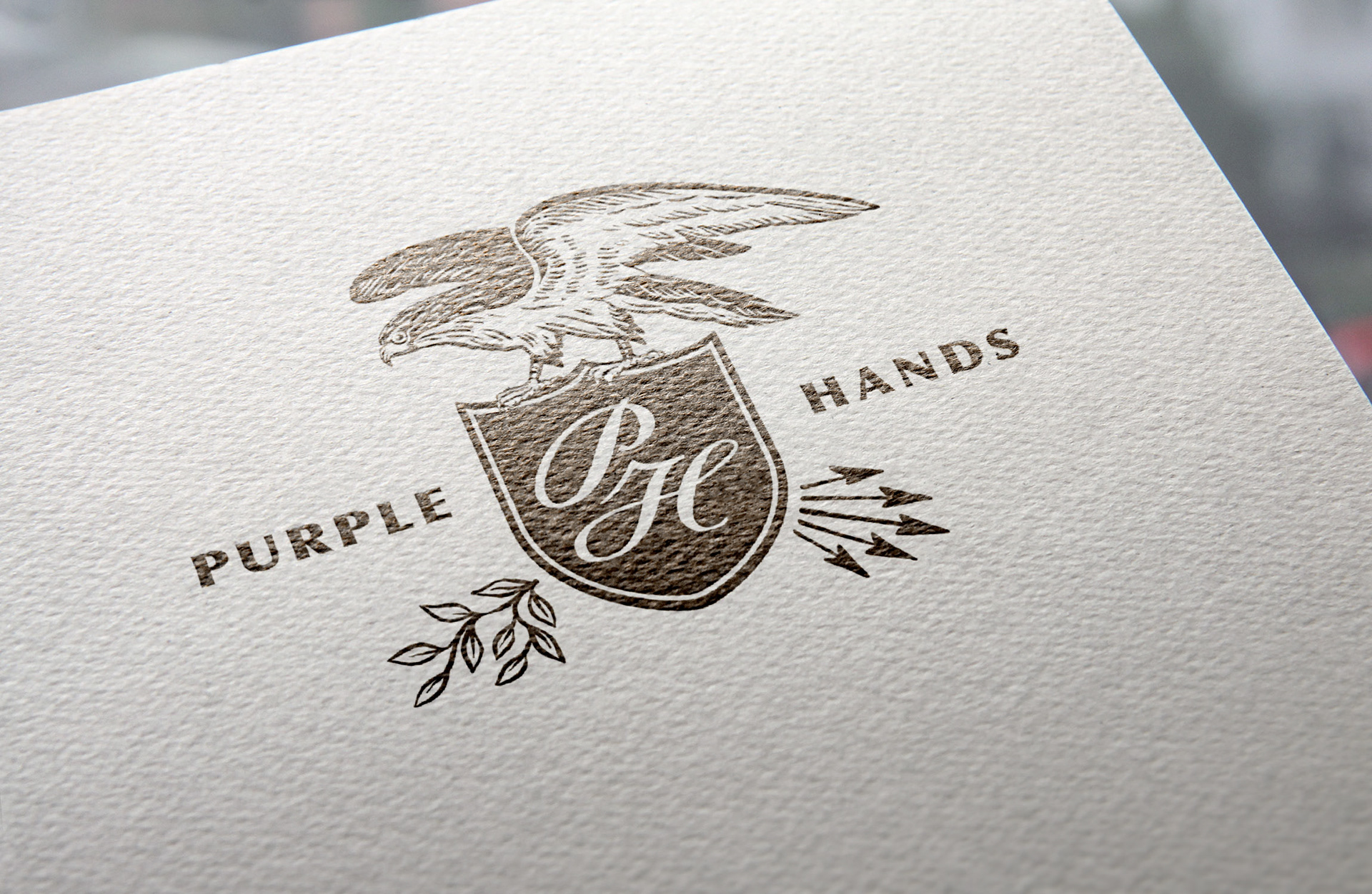
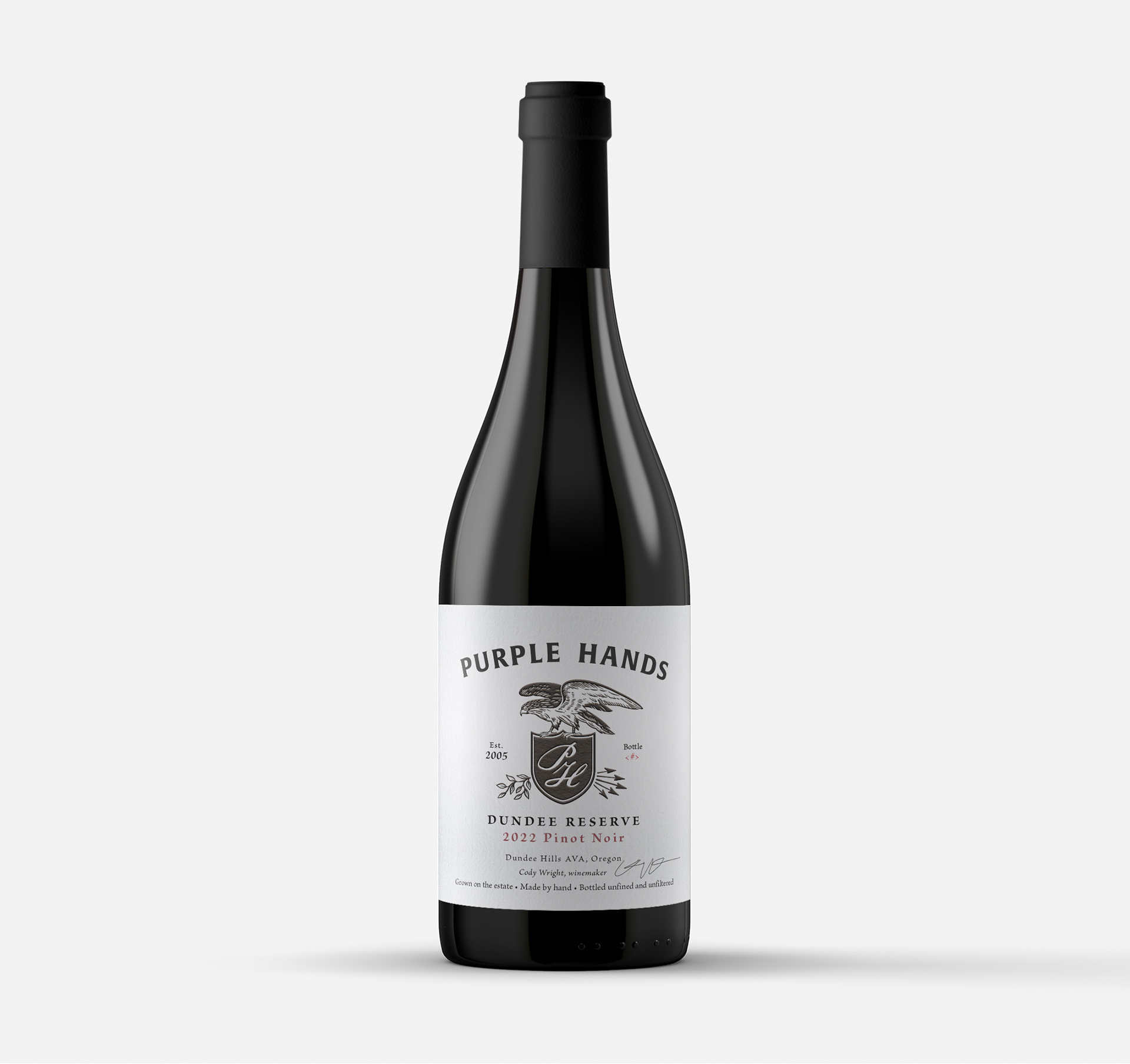
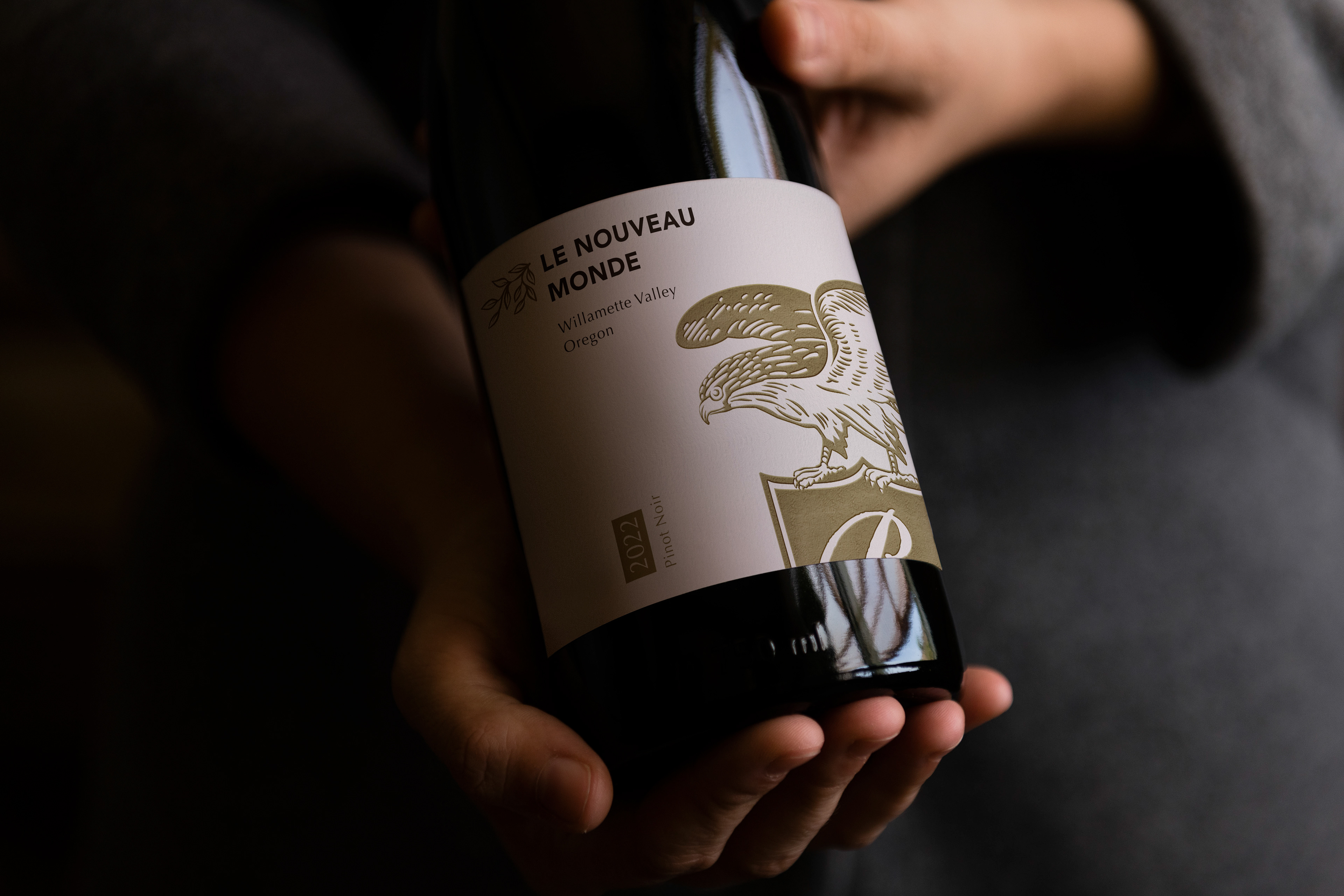
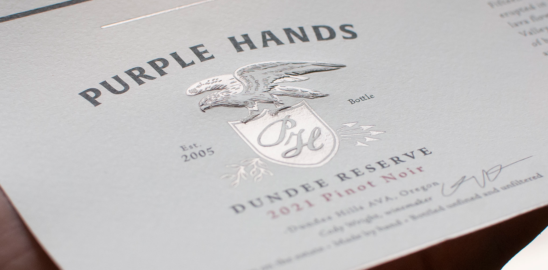
In 2023, Purple Hands (Wine spectators top 100 wines in the world list) came to us to help re-envision their brand identity and bottle labels. To "grow-up" their brand, as they put it. We started with an overhaul of their logo identity. By simplifying their logo and replacing the bald-eagle with a red-tail hawk we turned an unwieldy, and irrelevant logo system into something meaningful and more broadly "useable". By simplifying and strengthening their logo mark we were able to situate the label art, like the winemaking philosphy, around the vineyards. With big bold type and nuanced embellishment we created a label system that celebrates Oregon winemaking by emphasizing the Oregon vineyards where the wines originate.